
Racing Minds

Our Client
Who is Racing Minds?
Racing Minds is a nonprofit organization focused on improving mental health through running experiences. They work with people of all ages and abilities to help show them the positive impact of running on one’s mental and physical health.

What Makes Them Special?
Racing Minds is a nonprofit organization focused on improving mental health through running experiences. They work with people of all ages and abilities to help show them the positive impact of running on one’s mental and physical health.

Stakeholder Meeting
Goals
The top goals for the Racing Minds board members included strengthening the brand, increase participation and engagement, and creating a user-friendly and accessible design for users to navigate.
Priorities
Priorities of the Racing Minds board members included to highlight inclusivity and mental health focus, streamline race info and communication, and making a user-friendly and visually appealing site.
Target Audience
The target audience for this project was for potential members of the Racing Minds website

Brand Audit
First I conducted a analysis of the existing Racing Minds website to see what their current visual style was like and evaluate the sites consistency
-
Original site mostly used a variety of blues and greens
-
The original site used non-rounded rectangles for buttons, input fields, and images. Their buttons had a very slight color change for a hover state
The store used a built in Zeffy feature that had rounded elements
-
Icons on the site included logos for Facebook and Instagram, as well as an email symbol, where were linked to their respective accounts
-
The site mainly used the fonts Roboto and Droid Serif for text and headings, as well as Montserrat for text such as input field labels
-
The Racing Minds logo is of a brain in bright green, blue, and yellow, with a silhouette of a person running on top


Research
-

Heuristic Evaluation
Evaluated the existing site to see what it did well, what they wanted to do, and what they could do better
-

Rewriting Prompts
Rewrote tasks and cards that the group proposed in order to reduce user bias and make the objective clear.
-

Sitemap
Made a sitemap of all the different pages on the existing Racing Minds site and how the all connected with each other

“How Might We amplify the positive aspects of family-focused events to inspire parental engagement?”

Initial Designs Created & Presented to Client
Upcoming Events
Shows races, explains Kids Run Club, provides running resources
Event Details
Downloadable race guides, explains who is allowed to run, provides weather policy, parking information, and Athlete’s Guild information
Past Events
Real user testimonials, photos and videos from previous events, social media links, leave a review


Design System
I created a design system to help provide the team and client with guidelines to help maintain consistency across different pages on the site
Colors
Typography
Icons
Buttons
Text Groups
Cards & Other Elements


Footer Redesign

Original Footer Design
Contrast Errors
Button background too light for footer background
Button text too light for button background
White & grey text too light for background

Alternate Footer Design #1
Contrast Changes
Footer background made lighter to contrast dark text and button
Button background darkened and button text changed to white
Footer text changed to dark grey to contrast lighter footer background

Chosen Footer Design
Contrast Changes
Footer background made darker
Button given a border that correctly contrasts with footer background
Button background made darker and used white text
White text is correctly contrasted against darker footer background

Redesign to Fit Design System


First Impressions Survey
After conducting a first impressions survey, it was found that the event pages gave clear and inclusive information, clear call to actions, and did a good job helping build the users trust with the organization.
Recommendations included reducing the amount of events shown at once to help reduce chances of visually overwhelming the user as well as improving the visual design for the gallery.

Post-Survey Upcoming Events
-

Pre-Survery Upcoming Events List
-

Post-Survey Upcoming Events List
Changes Made Include
- Only shows 3 events and hide rest under a show more
- Includes icons to designate if event is open to all ages or if it is only children 14 and below

Post-Survey Upcoming Events
-

Pre-Survery Gallery
-

Post-Survey Gallery
Changes Made Include
- Arrows now show preview of next photo
- Section that says what photo you are on out of all photos in folder
- Hide folders more easily recognized as a button
- Changed color scheme of folders

Prototyping
I made the prototype of the final design and connected all the different pages as well as the different interactions within the site, including: the:
Navigation Bar
Anchor Links
Button States & Button Actions
Donation Card
Gallery

Client Handoff
On April 23rd the group presented our final designs to the Racing Minds team. I walked them through the designs for the 4 events pages, and let them know why I made the choices I did, how to implement the changes, and how those choices would help them reach their goals
Upcoming Events
Only show next 3 events to help not overwhelm user
Use icons to designate ages to help make clear what events apply to their needs
Explain what Kids Run Club is and why parents should enroll child to help motivate users to sign up
Event Details
Use icons and color to help make the weather policy stand out
Explain what races parents can run alongside their child for free, and what events they must register to run with them, in order to help reduce confusion and upset on race day
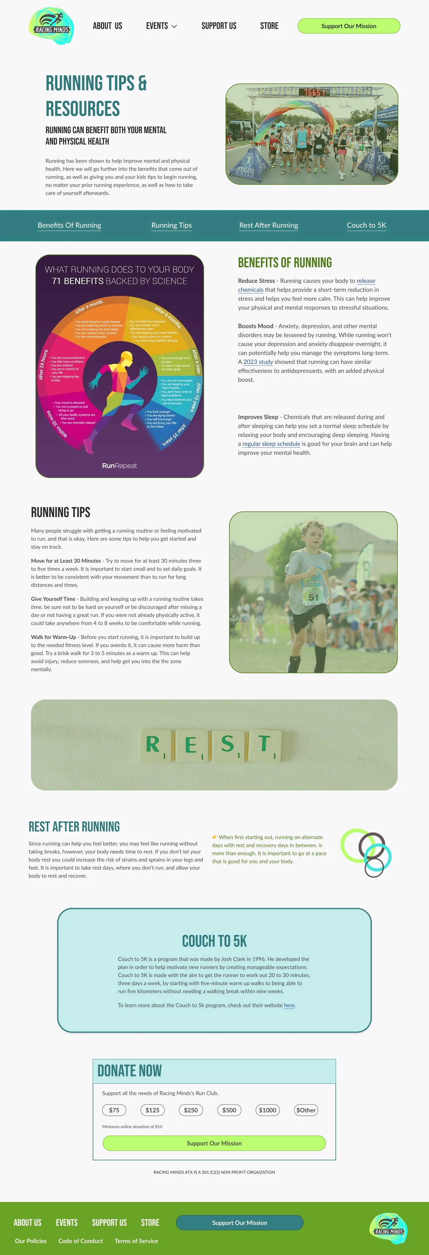
Running Resources
Make your own infographics in order to not use copyrighted materials
Keep information brief and too the point in order to reduce user boredom which leads to them leaving page prematurely
Past Events
Separate photos and videos into folders based off of the event they were taken from in order to help users find photos relevant to themselves
Make gallery accessible by including a caption and showing user what photo number they are on out of the number of photos in folder
Research Section Vectors From Freepik [1] [2] [3]Racing Minds Logo From Racing Minds